CSS Basics Tutorial
Get a solid foundation in computer programming by reading our comprehensive tutorial,
Learn the Fundamentals of Progarmming The Building Blocks of Computer Programming.
Concepts:
1. CSS Introduction
The Cascading Style Sheets (CSS) is a language used for presenting the look and formatting of a document written in HTML. It is used to control the appearance of web pages, including colors, layout, and font styles.
To use CSS, you'll need to create a stylesheet file and link it to your HTML document.
Here's an example of how you can use CSS with HTML to style a webpage
First, create an HTML document with some basic content:
<!DOCTYPE html>
<html>
<head>
<title>My Website</title>
</head>
<body>
<h1>Welcome to my website!</h1>
<p>This is some sample content.</p>
</body>
</html>
Next, create a CSS stylesheet and link it to your HTML document. You can do this by adding a <link> element in the <head> of your HTML document, like this:
<head>
<title>My Website</title>
<link rel="stylesheet" type="text/css" href="styles.css">
</head>
Now you can add your styles to the styles.css file. For example, you could change the font size of the <h1> element and the color of the <p> element:
h1 {
font-size: 32px;
}

p {
color: blue;
}
With these styles in place, the text in the <h1> element will appear larger and the text in the <p> element will be blue when you view the webpage in a browser.
Why to learn CSS?
CSS is used to control the appearance and layout of web pages, and it is an essential part of the front-end development process. If you want to build websites or work in web development, you'll need to be proficient in CSS.
CSS is an important part of becoming a proficient web developer and can be a valuable skill in many different careers.
2. CSS Syntax
The syntax for CSS consists of a set of rules that specify how styles should be applied to elements in an HTML document. In CSS, the each rule is consists of a 'selector' and a 'declaration block'.
selector {
property: value;
}
Here's an example of a CSS rule that sets the font size and color of all <h1> elements to 32px and green, respectively:
h1 {
font-size: 32px;
color: green;
}
3. CSS Styling
There are three ways that you can style a website
1. Inline CSS
Inline CSS is used to apply style to a single element directly on HTML element. To use inline CSS, you can use the 'style' attribute in the HTML element.
<p style="color: blue; font-size: 18px;">This is some text.</p>
2. Internal CSS
Internal CSS is used to style a specific HTML document. To use internal CSS, you can include a <style> element in the <head> of your HTML document and add your styles between the <style> and </style> tags.
<head>
<style>
p {
color: blue;
font-size: 18px;
}
</style>
</head>

<body>
<p>Welcome to webdevmonk</p>
</body>
3. External CSS
External CSS is used to style many HTML documents. This is the recomended to most people. To use external CSS, you can create a separate CSS file and link to it from your HTML document using a <link> element in the <head> of your HTML document.
<head>
<link rel="stylesheet" type="text/css" href="style.css">
</head>

<body>
<p>Welcome to webdevmonk</p>
</body>
The content in the css file might be
/* this is style.css file */
p {
color: blue;
font-size: 18px;
}
4. CSS Comments
You can use comments in CSS to add notes or explanations to your stylesheet. Comments can be helpful for keeping track of what your styles do and for communicating with other developers who may be working on the same stylesheet.
/* This is a comment */

body {
/* This is another comment */
background-color: lightblue;
}
CSS comments are ignored by the browser and are not displayed in the rendered page.
5. CSS Selectors
CSS selectors are used to specify which elements a CSS rule should be applied to. There are many different types of selectors that you can use, including element, class, ID, and attribute selectors.
/* element selectors: This rule will apply the color red to all <p> elements in the HTML document. */
p{
color:blue;
}
<p class="warning">This is a warning</p>
/* class selectors: Class selectors apply a style to all elements with a particular class attribute. To use a class selector, you must first define the class in the HTML element, and then you can use a '.' followed by the class name in the CSS rule */

.warning {
color: red;
}
<div id="main-content">...</div>
/* ID selectors: ID selectors apply a style to a single element with
a particular ID attribute.
To use an ID selector, you must first define the ID in the
HTML element, and then you can use a '#' followed by the ID name in the CSS rule.
*/

#main-content {
width: 960px;
margin: 0 auto;
}
6. CSS colors
CSS allows you to specify colors in a number of different ways. Some of the most common ways to specify colors in CSS include:
1. Using named colors: There are a set of predefined named colors that you can use in CSS. like "blue", "green", "lightblue", etc.
p {
color: purple;
}
2. Using RGB values: RGB (Red, Green, Blue) values allow you to specify a color by its levels of red, green, and blue. You can specify an RGB value using the rgb() function, with values ranging from 0 to 255 for each color component.
p {
color: rgb(255, 0, 0);  /* red */
}
3. Using HSL values: HSL (Hue, Saturation, Lightness) values allow you to specify a color by its hue, saturation, and lightness. You can specify an HSL value using the hsl() function, with values ranging from 0 to 360 for the hue, and 0 to 100 for the saturation and lightness
p {
color: hsl(120, 100%, 50%);  /* green */
}
4. Using hexadecimal values: Hexadecimal values allow you to specify a color using a six-digit code. The first two digits represent the level of red, the second two digits represent the level of green, and the final two digits represent the level of blue.
p {
color: #FF0000;  /* red */
}
CSS background-color
The background-color property is used to state the background color of an element. You can use it to change the color of the background of any element on your web page, including the <body> element, <div> elements, and even individual table cells or list items.
body {
background-color: lightblue;
}

div {
background-color: rgb(255, 255, 0);  /* yellow */
}

td {
background-color: #FFFF00;  /* yellow */
}
You can also use the 'background-color' property to create a transparent background by specifying the 'transparent 'value.
div {
background-color: transparent;
}
7. CSS backgrounds
The 'background' property can be used to set the background color, image, repeat style, attachment, and position of an element.
You can also use the 'background-color', 'background-image', 'background-repeat', 'background-attachment', and 'background-position' properties individually if you only want to set specific background-related properties.
div {
background-color: red;
background-image: url("image.jpg");
background-repeat: repeat-y;
}
8. CSS margins and padding
The 'margin' and 'padding' properties in CSS are used to create space around and within elements.
margin: The 'margin'property is used to create space around an element. It clears an area outside the border of an element. The margin property can be set for individual sides (margin-top, margin-right, margin-bottom, margin-left) or for all sides at once (margin).
p {
margin: 20px;  /* sets a 20px margin on all sides */
}
p {
margin-top: 10px;
margin-right: 15px;
margin-bottom: 5px;
margin-left: 20px;
}
padding: The padding property is used to create space within an element, around the content. It clears an area inside the border of an element. Like the margin property, the padding property can be set for individual sides (padding-top, padding-right, padding-bottom, padding-left) or for all sides at once (padding).
div {
padding: 20px;  /* sets a 20px padding on all sides */
}
p {
margin-top: 10px;
margin-right: 15px;
margin-bottom: 5px;
margin-left: 20px;
}
I recommend learning more about these properties and practicing with them to get a better understanding of how they work.
9. CSS Borders
The border property in CSS is used to specify the border of an element. You can use the border property to set the border width, style, and color for an element.
div {
border: 2px solid blue;
}
You can also use the 'border-width', 'border-style', and 'border-color' properties individually if you only want to set specific border-related properties.
div {
border-width: 2px;
border-style: solid;
border-color: blue;
}
10. CSS Units
CSS allows you to specify sizes and dimensions using a variety of units. Some of the most common CSS units are:
1. px (pixels): A pixel is a dot on the screen, and the size of a pixel depends on the resolution of the device.
2. em (ems): An em is a unit of measurement that is equal to the current font size. 1 em is always equal to 16px (pixels)
3. rem (root ems): A rem is similar to an em, but it is always relative to the root element's font size (typically the element).
4. % (percentages): Percentages are used to specify sizes as a percentage of another value. For example, you can use percentages to specify the width of an element as a percentage of its parent element's width.
5. vw (viewport widths): A viewport width (vw) is a unit of measurement that is equal to 1% of the viewport's width.
6. vh (viewport heights): A viewport height (vh) is a unit of measurement that is equal to 1% of the viewport's height. Viewport heights are useful for specifying dimensions that are responsive to the size of the viewport.
<html>
<head>
<style>
body {
font-size: 16px;
}

div {
width: 80%;  /* 80% of the parent element's width */
margin: 2em;  /* 2 times the font size */
padding: 1rem;  /* 1 times the root element's font size */
border: 1vw solid blue;  /* 1% of the viewport's width */
height: 50vh;  /* 50% of the viewport's height */
}
</style>

</head>

<body>

<div>
This is a div element with various CSS units applied to its dimensions and spacing.
</div>
</body>

</html>
11. CSS List Style
The 'list-style' property in CSS is used to specify the style of a list item marker (e.g., a bullet or numbering) for ordered and unordered lists
ul {
list-style: square;
}
The 'list-style' property sets the list item marker style to squares for all unordered lists in the document.
There are many values that you can use for 'list-style' property:
1. disc: A filled circle
2. circle: An unfilled circle
3. square: A filled square
4. none: Decimal numbering (e.g., 1, 2, 3)
5. decimal: Lowercase Roman numbering (e.g., i, ii, iii)
6. lower-roman: Uppercase Roman numbering (e.g., I, II, III)
7. upper-roman: Lowercase alphabetical numbering (e.g., a, b, c)
8. lower-alpha: Uppercase alphabetical numbering (e.g., A, B, C)
9. upper-alpha: No list item marker
12. CSS Text Styling
CSS provides a number of properties that you can use to style the text in your web pages.
1. color: he color property is used to specify the color of the text.
2. font-family: The 'font-family' property is used to specify the font family to use for the text. You can specify a specific font family (e.g., "Arial"), or you can specify a list of font families in case the first choice is not available on the user's device.
3. font-size: The 'font-size' property is used to specify the size of the text.
4. font-weight: The 'font-weight' property is used to specify the weight (boldness) of the text. You can use values like "normal" or "bold" to set the font weight, or you can use numerical values ranging from 100 to 900 to specify the font weight more precisely.
5. text-allign: The 'text-align' property is used to specify the alignment of the text within an element. You can use values like "
p {
color: blue;
font-family: Arial, sans-serif;
font-size: 16px;
font-weight: bold;
text-align: center;
}
13. CSS border-radius
The 'border-radius' property in CSS allows you to add rounded corners to an element's border.
.my-element {
border-radius: 10px;
}
This will give all four corners of the element a radius of 10px. You can also specify different radii for each corner using the following syntax:
.my-element {
border-radius: 10px 20px 30px 40px;
}
This will give the top-left corner a radius of 10px, the top-right corner a radius of 20px, the bottom-right corner a radius of 30px, and the bottom-left corner a radius of 40px.
14. CSS height and width
In CSS, the 'height' and 'width' properties are used to specify the height and width of an element, respectively.
.my-element {
height: 200px;
width: 100px;
}
This will set the element's height to 200 pixels and its width to 100 pixels.
You can also use the 'height' and 'width' properties to set the dimensions of an element using a percentage value, which will be calculated based on the dimensions of the element's parent container.
.my-element {
height: 50%;
width: 75%;
}
This will set the element's height to 50% of the height of its parent container, and its width to 75% of the width of its parent container.
15. CSS Box Model
The CSS box model is a way of representing the layout of an HTML element on a web page. Generally, it consists of four parts: the content, padding, margin, and padding.
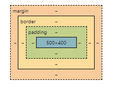
The content of the element is the actual content of the element, such as text or images. The padding is the gap between the content and the border. The border is the line that surrounds the content and padding. And the margin is the space outside the border.
You can use CSS properties such as 'height', 'width', 'padding', 'border', and 'margin' to control the dimensions and spacing of the different parts of the box model.
.my-element {
width: 300px;
height: 200px;
padding: 10px;
border: 1px solid black;
margin: 20px;
}
This will create an element that is 300 pixels wide and 200 pixels tall, with a 10-pixel padding, a 1-pixel black border, and a 20-pixel margin.
16. CSS Positions
In CSS, the position property is used to control the positioning of an element on a web page. There are five possible values for the 'position' property: static, relative, absolute, fixed, and sticky.
static: This is the default value for the position property. Elements with a static position are not affected by the top, bottom, left, or right properties, and they will appear in the normal flow of the page.
relative: Elements with a relative position are positioned relative to their normal position in the flow of the page. You can use the top, bottom, left, and right properties to adjust the element's position relative to its normal position.
absolute: Elements with an absolute position are positioned relative to their nearest ancestor element that has a position value of relative, absolute, or fixed. If no such ancestor exists, the element is positioned relative to the initial containing block of the document. You can use the top, bottom, left, and right properties to adjust the element's position.
fixed: Elements with a fixed position are positioned relative to the initial containing block of the document, and they will remain in the same position on the page even when the page is scrolled. You can use the top, bottom, left, and right properties to adjust the element's position.
sticky: The sticky value for the position property in CSS allows you to create an element that is "sticky" on the page, meaning that it remains in a fixed position when the page is scrolled, until a certain scroll position is reached.
<div class="container">
<div class="static">Static</div>
<div class="relative">Relative</div>
<div class="absolute">Absolutelt;/div>
<div class="fixed">Fixed</div>
<div class="sticky">Sticky</div>
</div>
.static {
position: static;
}

.relative {
position: relative;
top: 10px;
left: 20px;
}

.absolute {
position: absolute;
top: 30px;
right: 40px;
}

.fixed {
position: fixed;
bottom: 50px;
left: 60px;
}

.sticky {
position: sticky;
top: 0;
}
17. CSS Flex
The CSS flex layout is a flexible layout model that allows you to control the layout and sizing of elements within a container. It allows you to specify how elements should be distributed within the container, and how they should be sized based on the available space.
To use the flex layout, you need to set the 'display' property of the container element to 'flex' or 'inline-flex'. You can then use the 'flex-direction', 'flex-wrap', and 'justify-content' properties to control the layout of the child elements within the container
.container {
display: flex;
flex-direction: row;
justify-content: space-between;
}
This will create a row of elements, with the first element at the start of the row, the last element at the end of the row, and the other elements evenly distributed between them.
You can also use the align-items and align-self properties to control the vertical alignment of the elements within the container.
.container {
display: flex;
flex-direction: column;
align-items: center;
}
This will create a column of elements, with all of the elements vertically centered within the container.
18. CSS Grid
The CSS grid layout is a two-dimensional layout model that allows you to create complex, responsive layouts using rows and columns. It allows you to specify how elements should be positioned and sized within a container, and how they should behave when the size of the container or the size of the elements changes.
To use the grid layout, you need to set the 'display' property of the container element to 'grid' or 'inline-grid'. You can then use the 'grid-template-columns' and 'grid-template-rows' properties to specify the number and size of the columns and rows in the grid.
.container {
display: grid;
grid-template-columns: 1fr 1fr 1fr;
grid-template-rows: 50px 50px;
}
This will create a grid with three columns that are each 1 fraction unit wide, and two rows that are each 50 pixels tall.
You can then use the 'grid-column' and 'grid-row' properties to specify the position of the child elements within the grid.
.element-1 {
grid-column: 1 / 3;
grid-row: 1 / 2;
}

.element-2 {
grid-column: 2 / 4;
grid-row: 1 / 3;
}

.element-3 {
grid-column: 1 / 2;
grid-row: 2 / 3;
}
This will position the first element in the first and second columns of the first row, the second element in the second and third columns of the first and second rows, and the third element in the first column of the second row.
19. CSS Z-index
The 'z-index' property in CSS is used to specify the stack order of elements that overlap. Elements with a higher 'z-index' value will be stacked in front of elements with a lower 'z-index' value.
The 'z-index' property only applies to elements that have a position value of 'absolute', 'relative', or 'fixed'. It does not apply to elements with a position value of 'static'.
.element-1 {
position: absolute;
z-index: 1;
}

.element-2 {
position: absolute;
z-index: 2;
}
In this example, the element-2 element will be stacked in front of the element-1 element, because it has a higher 'z-index 'value.
Note that the 'z-index' property only affects the stacking order of elements within the same parent element.
20. CSS Attribute Selectors
In CSS, attribute selectors allow you to style elements based on their attributes and attribute values.
[attribute]: Selects elements that have the specified attribute, regardless of the attribute's value.
[title] {
/* Styles all elements that have a "title" attribute */
}
[attribute=value]: Selects elements that have the specified attribute with the specified value.
[type="text"] {
/* Styles all elements that have a "type" attribute with a value of "text" */
}
[attribute~=value]: Selects elements that have the specified attribute with a value that contains the specified word.
[class~="warning"] {
/* Styles all elements that have a "class" attribute with a value that contains the word "warning" */
}
[attribute|=value]: Selects elements that have the specified attribute with a value that starts with the specified value, followed by a hyphen.
[lang|="en"] {
/* Styles all elements that have a "lang" attribute with a value that starts with "en" followed by a hyphen */
}
21. CSS Transitions
CSS transitions allow you to change the value of a CSS property over time, creating a smooth, animated effect.
To create a transition, you need to specify the CSS property that you want to animate, the duration of the transition, and any other transition properties such as the transition timing function and the delay before the transition starts.
.my-element {
width: 100px;
transition: width 1s ease-in-out;
}

.my-element:hover {
width: 200px;
}
In the above CSS example, when the user hovers over the .my-element element, the width of the element will smoothly transition from 100 pixels to 200 pixels over the course of 1 second, using the ease-in-out timing function.
You can use transitions to animate any CSS property that has a numeric value, such as 'width', 'height', 'opacity', and so on.
22. CSS Animations
CSS animations allow you to create more complex, multi-step animations by specifying a series of keyframes that define the values of CSS properties at different points in the animation.
To create an animation, you need to define the keyframes of the animation using the '@keyframes' rule, and then apply the animation to an element using the animation property.
@keyframes fade {
0% {
opacity: 0;
}
50% {
opacity: 1;
}
100% {
opacity: 0;
}
}

.my-element {
animation: fade 1s infinite;
}
In this example, the fade animation will be applied to the .my-element element, and it will repeat indefinitely. The animation will start at an 'opacity' of 0, gradually increase to an 'opacity' of 1 at the 50% mark, and then gradually decrease back to an 'opacity' of 0 at the 100% mark.
You can use the 'animation-duration', 'animation-timing-function', and 'animation-delay' properties to control the duration, timing, and delay of the animation.
Thank You
Thank you for visiting webdevmonk and for reading our CSS3 tutorial. We are glad that you took the time to learn more about this powerful styling language and hope that you found the information helpful. If you enjoyed your visit to our site, we would be grateful if you would share it with your friends and encourage them to visit us as well.